Creating a Mobile-Friendly Site for Maximum SEO Success


Every digital marketing manager knows how quickly a customer can leave if a mobile site does not deliver. Mobile performance matters because users now expect seamless speed and adaptability, especially when browsing from smartphones and tablets. With insights from responsive design techniques and mobile usage research, you will discover actionable strategies to assess your site and create a smoother, more engaging shopping experience that drives higher SEO and customer loyalty.
Table of Contents
- Step 1: Assess Current Mobile Performance
- Step 2: Plan Mobile-First Design Elements
- Step 3: Implement Responsive Site Features
- Step 4: Optimize Site Speed and Media
- Step 5: Test and Refine Mobile User Experience
Quick Summary
| Key Message | Explanation |
|---|---|
| 1. Assess Mobile Performance | Use tools like Google Analytics to evaluate mobile site metrics, including bounce rate and load speed. |
| 2. Embrace Mobile-First Design | Focus on essential content and a clean layout for small screens to enhance mobile user experience. |
| 3. Implement Responsive Features | Use flexible grid systems and media queries to ensure your site adapts seamlessly across devices. |
| 4. Optimize Speed and Media | Compress files and minimize HTTP requests to enhance loading times for a better user experience. |
| 5. Continuously Test User Experience | Conduct usability testing and gather feedback regularly to refine and improve mobile interaction. |
Step 1: Assess Current Mobile Performance
Understanding your website's mobile performance is crucial for SEO success. This step will help you diagnose potential issues and identify opportunities for improvement across different mobile devices and screen sizes.
To get started, leverage tools like Google Analytics and mobile usage research statistics to evaluate your current mobile performance. You'll want to analyze key metrics that reveal how visitors interact with your site on smartphones and tablets:
- Bounce rate for mobile users
- Average time on site from mobile devices
- Page load speed across different mobile networks
- Conversion rates for mobile traffic
Next, use technical assessment methods to understand your site's responsiveness. Responsive design techniques help you determine how well your website adapts to various screen sizes. Run comprehensive tests using:

Here's a comparison of key mobile performance assessment tools and what unique insights they offer:
| Tool Name | Main Focus | Unique Benefit |
|---|---|---|
| Google Analytics | User behavior metrics | Reveals retention and engagement patterns |
| Google's Mobile-Friendly Test | Design responsiveness | Pinpoints mobile usability issues |
| PageSpeed Insights | Load speed and optimization | Identifies site speed bottlenecks |
| Browser Developer Tools | Layout & device emulation | Tests real-time appearance on various devices |
- Google's Mobile-Friendly Test
- PageSpeed Insights
- Browser developer tools with device emulation
Your mobile performance directly impacts search rankings and user experience.
Pro-Tipp: Always test your website on multiple devices and network conditions to get a comprehensive view of its mobile performance.
Step 2: Plan Mobile-First Design Elements
Planning mobile-first design requires a strategic approach to create websites that look great and function seamlessly across all devices. This step will help you develop a design framework that prioritizes mobile user experience and performance.
Mobile-first design principles start by understanding that mobile devices demand a more focused and minimalist approach. Begin by stripping down your content to its most essential elements. This means:- Prioritize critical content for small screens
- Minimize visual clutter
- Use simple, clean typography
- Implement touch-friendly navigation
The goal is to create a lean, efficient design that scales up beautifully. Web design strategies emphasize starting with the smallest screen size and progressively enhancing the layout for larger devices. This approach ensures that your core message and functionality remain clear and accessible, regardless of the device.
When planning your mobile-first design, focus on:
To aid in planning an effective mobile-first design, reference these common design principles and their advantages:
| Design Principle | Core Focus | Impact on User Experience |
|---|---|---|
| Prioritizing essential content | Highlighting key information | Ensures clarity on small screens |
| Minimizing visual clutter | Removing distractions | Reduces cognitive overload |
| Touch-friendly navigation | Button and menu accessibility | Improves mobile interaction and usability |
| Responsive grid layouts | Fluid page structures | Adapts content seamlessly across devices |
- Defining your primary user actions
- Creating flexible, responsive grid layouts
- Selecting typography that reads well on small screens
- Optimizing image and media sizes
Mobile-first design is not just a trend - it's a user-centered approach to web development.
Pro tip: Always sketch your mobile design first on paper to understand how content will flow and prioritize before touching digital design tools.
Step 3: Implement Responsive Site Features
Implementing responsive site features transforms your website into a flexible, adaptable digital experience that works seamlessly across all devices. This crucial step involves strategically designing your site to look and function perfectly on smartphones, tablets, and desktop computers.
Responsive design techniques provide the foundation for creating flexible web layouts. Start by understanding and implementing key responsive strategies:
- Use flexible grid systems
- Create responsive image techniques
- Implement CSS media queries
- Design touch-friendly interfaces
The core of responsive design involves defining precise breakpoints that determine how your layout adapts to different screen sizes. This means carefully crafting CSS rules that restructure your content dynamically:
- Establish base mobile layout first
- Add complexity for larger screens progressively
- Test across multiple device sizes
- Optimize performance for each screen type
Responsive design is about creating an experience, not just a resized webpage.
Pro tip: Always test your responsive design on real devices, not just browser emulators, to catch subtle layout and interaction nuances.
Step 4: Optimize Site Speed and Media
Optimizing your website's speed and media performance is critical for delivering an exceptional mobile user experience that keeps visitors engaged and search engines happy. This step focuses on transforming your site into a lightning-fast, media-efficient powerhouse.
Web performance optimization techniques provide the foundation for creating a responsive and quick-loading website. Focus on these key strategies:- Compress images and media files
- Minimize HTTP requests
- Leverage browser caching
- Use content delivery networks (CDNs)
- Audit current site loading times
- Optimize image file sizes
- Enable browser and server-side caching
- Reduce server response times
Speed is not just a technical metric - it's a critical component of user experience.
Pro tip: Use tools like Google PageSpeed Insights to continuously monitor and incrementally improve your website's performance across all devices.
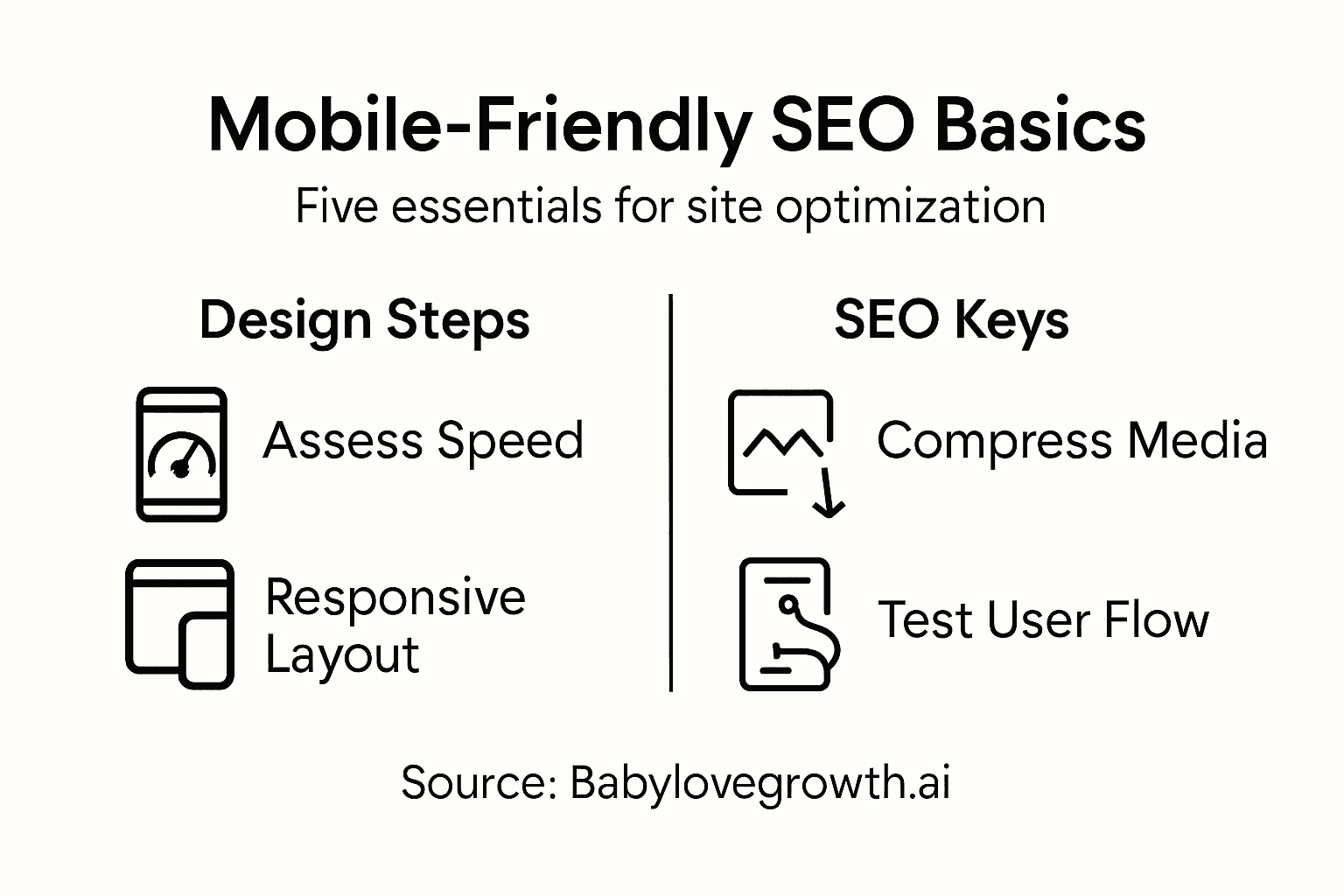
Step 5: Test and Refine Mobile User Experience
Testing and refining your mobile user experience is the critical final step in creating a website that truly connects with your audience. This phase transforms your technical design into a seamless, intuitive digital journey that keeps visitors engaged and converts more effectively.
User experience methodologies provide a structured approach to understanding how real users interact with your mobile site. Focus on collecting and analyzing user feedback through multiple channels:- Conduct usability testing
- Gather user feedback surveys
- Analyze interaction heatmaps
- Track mobile user behavior metrics
- Create user testing scenarios
- Record user interactions
- Analyze pain points and friction areas
- Implement targeted improvements
Your mobile experience should feel effortless and intuitive to every user.
Pro tip: Recruit diverse test users who represent your target audience to uncover nuanced insights that automated testing might miss.
Unlock Seamless Mobile-First SEO Success with AI-Powered Automation
Creating a mobile-friendly website that ranks high and engages users is a challenge every business owner and marketer faces today. The article highlights pain points like optimizing site speed, prioritizing essential content, and delivering a flawless mobile user experience—all vital for maximizing SEO impact on Google and ChatGPT. Achieving this requires ongoing content refinement, strategic backlinking, and responsive design features that many find overwhelming.
At Babylovegrowth.ai, we understand these struggles and offer an all-in-one platform that simplifies your mobile SEO journey through AI-driven content creation and automated backlink strategies. Our solution provides a 30-day personalized content plan tailored to boost mobile search rankings while optimizing critical SEO elements highlighted in the article such as page speed and user engagement. Experience how our rank-high services on Google and ChatGPT can transform your mobile site into an SEO powerhouse without endless manual effort.
Stop letting mobile SEO challenges hold your growth back.
Ready to create a mobile-friendly site that drives organic traffic effortlessly Take the first step now with Babylovegrowth.ai and let our AI-powered platform handle the complex SEO details for you. Explore how to improve your site’s speed, structure content for mobile users, and build quality backlinks—all on autopilot. Visit our site today to start your free trial and witness your SEO soar with less hassle.
Frequently Asked Questions
How can I assess my website's current mobile performance?
To assess your website's current mobile performance, analyze key metrics such as bounce rate, average time on site, and conversion rates from mobile devices. Utilize tools like Google Analytics to gather this data and identify areas for improvement within the next 30 days.
What are the key principles for planning a mobile-first design?
Key principles for planning a mobile-first design include prioritizing critical content, minimizing visual clutter, and implementing touch-friendly navigation. Start by sketching out your design on paper to ensure you focus on essential elements before utilizing digital tools.
How do I implement responsive features on my website?
To implement responsive features on your website, use flexible grid systems, responsive images, and CSS media queries. Begin by establishing a base mobile layout and progressively enhance for larger screens, testing the design across multiple devices for optimal viewing.
What steps should I take to optimize my site's speed and media?
To optimize your site's speed and media, compress images, minimize HTTP requests, and enable browser caching. Conduct a site audit to identify slow-loading pages and aim to reduce load times by at least 30% within 60 days.
How can I effectively test and refine my mobile user experience?
To test and refine your mobile user experience, conduct usability testing and gather user feedback. Set up scenarios for real users, analyze their interactions, and make targeted improvements based on their feedback to enhance usability and conversion rates.
Recommended
Smart SEO,
Faster Growth!
Most Read Articles

Generative Engine Optimization (GEO)
Learn how Generative Engine Optimization (GEO) helps your content rank in AI search engines like ChatGPT and Google AI. This comprehensive guide explains the differences between SEO and GEO, why it matters for your business, and practical steps to implement GEO strategies for better visibility in AI-generated responses.
DylenJan 18, 2025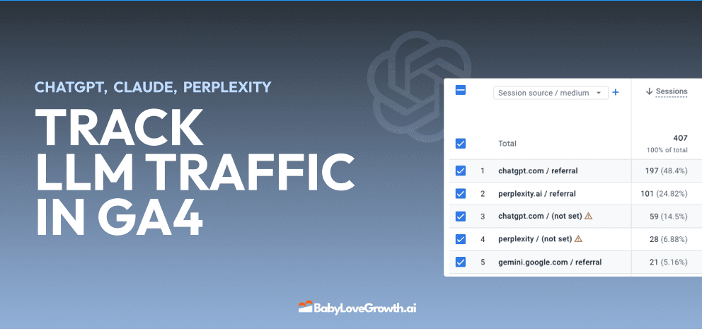
Track LLM Traffic in Google Analytics 4 (GA4)
Learn how to track and analyze traffic from AI sources like ChatGPT, Claude, Perplexity, and Google Gemini in Google Analytics 4. This step-by-step guide shows you how to set up custom filters to monitor AI-driven traffic and make data-driven decisions for your content strategy.
DylenMar 18, 2025
How to Humanize AI Text with Instructions
Learn practical techniques to make AI-generated content sound more natural and human. This guide covers active voice, direct addressing, concise writing, and other proven strategies to transform robotic text into engaging content.
DylenApril 7, 2025
Open AI Revenue and Statistics (2024)
Comprehensive analysis of OpenAI financial performance, user engagement, and market position in 2023. Discover key statistics including $20B valuation, $1B projected revenue, and 100M+ monthly active users.
DylenOctober 03, 2025