Impact of Mobile Optimization: Boosting E-commerce SEO


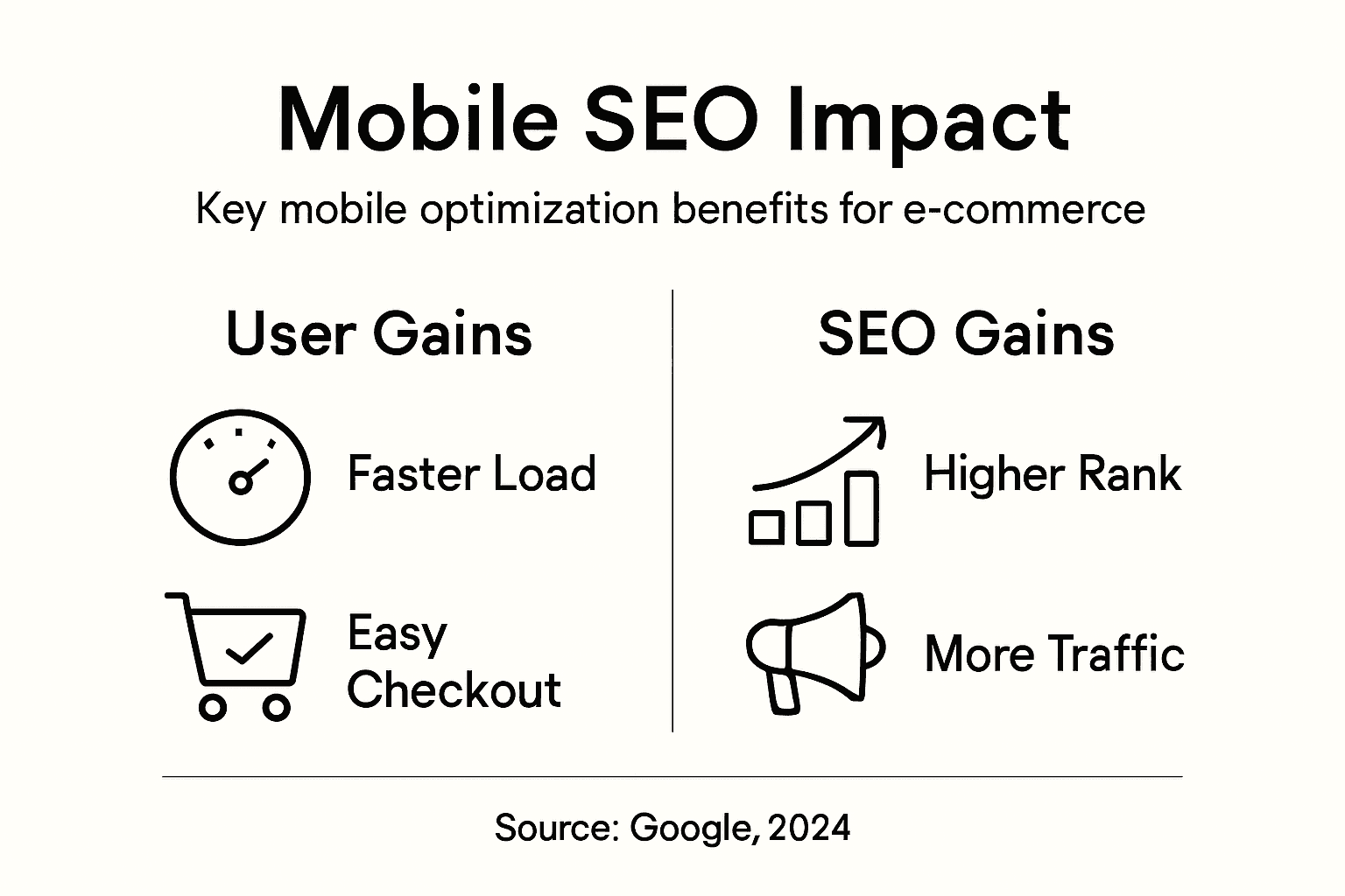
Trying to keep up with customers who shop from cafes, subways, and living rooms is a daily reality for any e-commerce team. As mobile shopping becomes the default behavior, a site that looks good but stumbles on phones costs real sales. A truly mobile-optimized experience means adapting your store to fit how people search, scroll, and buy on smartphones and tablets. This approach not only makes navigation easier but also improves your SEO standing as Google now prioritizes mobile-first sites for higher rankings.
Table of Contents
- Defining Mobile Optimization For E-commerce
- Key Features Of Mobile-Optimized Websites
- User Behavior Shifts In Mobile-First Era
- SEO Benefits And Google's Mobile Policies
- Common Mobile Optimization Mistakes To Avoid
Key Takeaways
| Point | Details |
|---|---|
| Mobile Optimization is Essential | Over half of e-commerce traffic comes from mobile devices, so optimizing for a seamless mobile shopping experience is crucial for retention and sales. |
| Responsive Design Improves SEO | A mobile-optimized site with responsive design enhances user experience and positively impacts search engine rankings through Google's mobile-first indexing. |
| Performance Matters | Slow-loading sites drive away customers; optimizing loading times and touch elements is key to improving conversions. |
| Testing is Critical | Regularly test your mobile site on actual devices and connections to identify and fix user experience issues, thereby maintaining customer satisfaction. |
Defining Mobile Optimization for E-commerce
Mobile optimization for e-commerce means creating an experience where customers can browse, search, and buy seamlessly from their phones and tablets. It goes beyond simply shrinking your desktop site to fit a smaller screen. Instead, it involves designing websites that adapt to different mobile device screens and facilitating smooth interactions tailored to how people actually shop on the go. When your store is properly optimized for mobile, customers can find products quickly, read descriptions without squinting, and complete purchases without frustration. This matters because more than half of e-commerce traffic now comes from mobile devices, yet many small to medium businesses still treat mobile as an afterthought.
At its core, mobile optimization addresses specific challenges that don't exist on desktop. Mobile users face slower connections, smaller screens, and limited patience. Mobile e-commerce seeks to improve the experience by addressing challenges such as high costs, inefficiency, limited payment convenience, and poor product browsing clarity. Think about your own shopping habits. You probably browse products while commuting, check prices in store parking lots, and complete purchases from your couch. Your customers do the same. They want fast page load times, one-click checkout options, and clear product images that load instantly. A mobile-optimized site respects these realities instead of ignoring them.
The SEO connection here is direct and powerful. Google now prioritizes the mobile version of your website for search rankings through mobile-first indexing, meaning the search engine crawls and ranks based on your mobile experience first, not your desktop version. If your mobile site is slow, confusing, or poorly designed, your search visibility suffers immediately. Conversely, a responsive, fast, and easy-to-navigate mobile experience supports higher conversion rates and customer engagement, which sends positive signals back to Google. For e-commerce SEO, mobile optimization isn't optional. Understanding why SEO for e-commerce drives sustainable growth shows you how mobile fits into the bigger picture of organic visibility and customer acquisition.
Pro tip: Start by testing your store on actual mobile devices and poor connections (not just the browser simulator), then identify the three slowest or most confusing pages and fix those first before overhauling your entire site.
Key Features of Mobile-Optimized Websites
A mobile-optimized website isn't built from a checklist of buzzwords. It's built around how real people interact with phones and tablets. The foundation starts with responsive design, which automatically adjusts your layout based on the screen size your customer is using. Whether someone visits from a 6-inch phone or a 12-inch tablet, the content reflows intelligently without forcing horizontal scrolling or tiny text that requires constant pinching. Beyond responsiveness, responsive design fundamentally improves SEO success because Google recognizes it as a technical best practice for mobile-first indexing. Speed matters just as much. A mobile visitor will abandon your site within 3 seconds if it doesn't load, meaning file compression and caching optimization directly impact whether customers stay or leave before they ever see a product.
The practical details separate good mobile sites from great ones. Touch-friendly navigation means your menu buttons and links are sized for fingers, not mouse cursors. Your interactive elements should be at least 44 pixels tall and spaced so accidental clicks don't happen. Simplified forms reduce data entry friction by asking only essential questions and using appropriate keyboard types (number pads for phone numbers, email keyboards for addresses). Clear, concise content performs better on mobile because people scan quickly rather than read paragraphs. Your product descriptions, category pages, and call-to-action buttons should communicate value in as few words as possible. Click-to-call buttons let mobile shoppers reach you instantly without typing. Click-to-email functionality serves the same purpose. These small features remove friction from customer interactions and significantly boost conversion rates compared to generic contact forms.

Modern mobile optimization also considers the broader ecosystem your customers inhabit. Security and reliable hosting matter because mobile users notice slow or broken experiences immediately. Progressive web apps (PWAs) create app-like experiences without requiring app store downloads, reducing friction for first-time visitors. Integration with social media and location services allows you to reach customers where they already spend time and show inventory at nearby store locations. Testing across actual devices matters too, not just browser simulators. Responsive design on your desktop monitor can look completely different on an actual iPhone held by a customer in bright sunlight. Each of these elements works together, but the ones that move the needle for SEO are speed, touch optimization, and mobile-first content structure.
Pro tip: Use Google's mobile-friendly test tool to audit your current site, then prioritize fixing pages with the longest load times and poorest navigation before redesigning your homepage.
User Behavior Shifts in Mobile-First Era
Your customers aren't sitting at desks anymore. They're shopping in coffee shops, browsing during lunch breaks, and making purchase decisions in the checkout line at competing stores. The widespread adoption of mobile devices has fundamentally transformed user behavior across commerce, forcing e-commerce businesses to rethink everything about how they present products and process transactions. This shift isn't gradual or optional. Studies show that mobile commerce now accounts for over 50 percent of total e-commerce traffic in most developed markets, and that number keeps climbing. Users increasingly prefer accessing content on their phones because of the convenience and flexibility it offers. They don't want to wait for desktop versions to load or navigate clunky interfaces designed for mouse clicks. They want speed, clarity, and instant answers to their questions.
What makes this behavioral shift tricky is that mobile shopping feels different from desktop shopping in ways you might not expect. A customer browsing products on their phone has different goals than someone at a computer. They're moving fast, often distracted, and ready to abandon your site if anything feels slow or confusing. They use voice search more frequently, searching for things like "affordable running shoes near me" rather than typing out full queries. They trust reviews and photos more than lengthy product descriptions. They expect one-click checkout rather than multi-step forms. Understanding diverse mobility patterns and traffic consumption behaviors reveals that users engage with mobile networks differently depending on context. A shopper at home behaves differently than someone window shopping between meetings. Your site needs to accommodate both scenarios without requiring them to relearn your interface.
The purchasing psychology has shifted too. Mobile users are often in comparison mode, weighing your store against competitors instantly. They use their phones to check prices elsewhere, read reviews, and verify shipping costs before committing to a purchase. This means your mobile site must answer objections faster and build trust quicker than a desktop version. Mobile users are also more impulse-driven in some contexts and more cautious in others. A student scrolling during class might add items to a cart on a whim but never complete checkout. A busy professional making a quick purchase decision needs confidence and speed. The key is recognizing that mobile SEO strategies must align with these shifting user expectations and behaviors. Your content strategy, product pages, and checkout flow all need to account for these behavioral differences.
Pro tip: Analyze your mobile user flow using heat maps and session recordings to see where customers actually pause, scroll back, or abandon carts, then optimize those specific moments rather than redesigning your entire site.
SEO Benefits and Google's Mobile Policies
Google changed the game in 2016 when it announced mobile-first indexing, and most e-commerce businesses still haven't fully adjusted. Here's what this means for your store: Google now crawls and ranks your website primarily based on the mobile version, not the desktop version. This reversal of priority reflects Google's recognition that mobile traffic dominates user behavior. Google has implemented mobile-first indexing where the mobile version of a website's content is primarily used for indexing and ranking. If your mobile site is slow, confusing, or missing content that appears on desktop, Google sees it as inferior and ranks it lower. The opposite is also true: a mobile site that loads fast, displays products clearly, and processes checkout smoothly signals quality to Google, which boosts your rankings. This isn't a penalty system. It's Google saying mobile experience now determines success.
The SEO benefits of proper mobile optimization compound over time. Better rankings mean more organic traffic without paying for ads. Organic traffic converts better than paid traffic because customers are searching for what you sell rather than clicking random ads. A 167 percent improvement in organic visibility translates to sustainable growth that doesn't depend on advertising budgets. Mobile optimization also reduces bounce rate, which measures how many visitors leave without exploring your site. When bounce rates drop, engagement metrics improve, signaling to Google that your site deserves higher rankings. Page speed contributes directly to rankings as well. Google's ranking algorithm accounts for Core Web Vitals, which measure loading speed, interactivity, and visual stability, all characteristics of well-optimized mobile sites. A site that loads in 2 seconds outranks a similar site that loads in 5 seconds, assuming other factors are equal.
Google recommends a specific approach to achieve these benefits: responsive web design. Responsive design uses the same HTML and URL for all devices, simplifying maintenance and ensuring consistent content visibility across search results globally. This matters because it eliminates duplicate content issues that arise when you maintain separate mobile and desktop sites. It also means Google only needs to crawl one version of your site, making the process faster and more efficient. Alternative approaches like dynamic serving (delivering different code based on device) or separate mobile URLs create maintenance headaches and indexing risks. Responsive design is Google's clear preference, and following Google's preferences yields better rankings. The combination of fast loading, touch-friendly design, and single-URL architecture creates an SEO advantage that accumulates with every page you optimize.
Here's how responsive, dynamic, and separate mobile site approaches compare for e-commerce:
| Approach | Maintenance Effort | SEO Impact | User Consistency |
|---|---|---|---|
| Responsive Design | Low, single codebase | Strong, one URL | High, same experience |
| Dynamic Serving | High, device detection | Moderate, indexing risk | Varies by implementation |
| Separate Mobile Site | High, duplicate sites | Weak, potential issues | Can vary, not seamless |
Pro tip: Audit your site using Google's Core Web Vitals report in Search Console to identify pages with the slowest loading times or worst interactivity scores, then optimize those specific issues rather than attempting a full redesign.
Common Mobile Optimization Mistakes to Avoid
Most e-commerce businesses make mobile mistakes they don't even know about until their bounce rate spikes and conversion rate plummets. The first and costliest error is neglecting performance optimization, which results in slow load times that destroy user experience. A site taking 6 seconds to load loses half its visitors before they see a single product. But slow loading is just the symptom. The root cause is usually uncompressed images, render-blocking JavaScript, or unnecessarily large CSS files. Another critical oversight involves insufficient touch target sizes. Buttons and links that work fine with a mouse become nearly impossible to tap accurately on a phone. When customers accidentally click the wrong product or navigate to the wrong page repeatedly, they leave. Common mobile optimization mistakes include neglecting performance optimization and poor content hierarchy that fails to prioritize key information for small screens. Your menu buttons should be at least 44 pixels tall, with adequate spacing between elements so fingers don't create misclicks.
Content organization on mobile requires rethinking your entire information architecture. Desktop sites often bury critical details in sidebars or below the fold because screen real estate exists. Mobile doesn't offer that luxury. If your product pages show reviews, ratings, and shipping information way down the page on mobile, customers scroll past them without seeing why they should buy. They need to encounter your strongest selling points immediately. Poor navigation systems cause equal damage. A dropdown menu with 30 categories overwhelms mobile users who are already stressed about small screens. Simplify navigation by grouping related categories and using progressive disclosure (showing only what's relevant at each step). Many businesses also ignore accessibility standards like color contrast and font size, creating barriers for users with vision impairments or older customers using smaller phones. A 12-point font that reads fine on desktop becomes illegible on a 4-inch screen at arm's length.
Secondly, major mistakes in mobile development include ignoring cross-platform compatibility and omitting security measures that expose data risks. Your site might look perfect on iPhone but completely broken on Android devices with different screen dimensions or browsers. Test across actual devices, not just the Chrome developer tools simulator. Security oversights are even more dangerous. If your checkout page lacks HTTPS encryption or stores payment information insecurely, customers will notice the warning message and abandon their purchase. They might also avoid your store permanently if their data gets compromised. Finally, skipping thorough testing creates bugs that accumulate over time. A button that doesn't work on certain devices, a form field that accepts invalid input, or a checkout process that freezes on 4G connections are disasters that content optimization best practices help you prevent. Test your mobile site before pushing updates, not after customers complain.
Below is a summary of common mobile optimization mistakes and their business consequences:
| Mistake Type | Description | Negative Business Impact |
|---|---|---|
| Slow Load Times | Large files, poor compression | Lost sales, increased bounces |
| Small Touch Targets | Buttons/links too close | Customer frustration, drop-offs |
| Poor Content Hierarchy | Key info hard to find | Lower trust, fewer purchases |
| Inadequate Security | Lacking HTTPS, weak protection | Lost confidence, higher risk |
| Incomplete Device Testing | Unchecked cross-device issues | Bugs, negative reviews, returns |
Pro tip: Set up Google Analytics to track mobile-specific metrics like click-through rates on your mobile menu buttons and load time by device type, then identify the specific pages causing the highest bounce rates and fix those first.
Unlock the Full Potential of Mobile Optimization to Boost Your E-commerce SEO
Mobile optimization is no longer optional for e-commerce businesses trying to thrive in today’s mobile-first world. The article highlights key challenges like slow load times, confusing navigation, and lack of responsive design that cause frustrated mobile shoppers to abandon carts and tank your search rankings. If you want your store to perform well on Google’s mobile-first indexing and convert more mobile visitors, you need a strategy that addresses speed, touch-friendly interfaces, and content clarity specifically for mobile users.
At Babylovegrowth.ai, we specialize in helping businesses overcome these exact obstacles through AI-driven SEO content and backlink strategies that align perfectly with mobile user behavior. Our platform automates the creation of high-quality, mobile-optimized articles designed to increase organic traffic and improve your site’s mobile search visibility. Don’t let poor mobile experience hold your e-commerce growth back. Start your free trial now and see how our step-by-step method for SEO on autopilot can transform your mobile presence and boost your rankings. Learn more about why SEO for e-commerce drives sustainable growth and how responsive design improves SEO success.
Take control of your mobile SEO performance today by visiting Babylovegrowth.ai and experience smart growth that your customers and Google will reward.
Frequently Asked Questions
What is mobile optimization for e-commerce?
Mobile optimization for e-commerce involves creating a seamless browsing, searching, and purchasing experience for customers on their mobile devices. It includes responsive design, fast loading times, and touch-friendly navigation tailored to mobile users.
How does mobile optimization affect SEO?
Mobile optimization directly impacts SEO because Google uses mobile-first indexing. This means that the mobile version of your site is prioritized for search rankings. A well-optimized mobile site can improve your search visibility, engagement metrics, and ultimately conversion rates.
What are the key features of a mobile-optimized website?
Key features of a mobile-optimized website include responsive design that adapts to different screen sizes, fast loading times, touch-friendly navigation, simplified forms, clear content, and secure hosting. These elements create a better user experience and boost SEO performance.
What common mistakes should I avoid in mobile optimization?
Common mistakes in mobile optimization include slow load times, small touch targets, poor content hierarchy, inadequate security measures, and incomplete device testing. These issues can lead to high bounce rates and lost sales. Ensuring your site is optimized for mobile is essential for retaining customers.
Recommended
Smart SEO,
Faster Growth!
Most Read Articles

Generative Engine Optimization (GEO)
Learn how Generative Engine Optimization (GEO) helps your content rank in AI search engines like ChatGPT and Google AI. This comprehensive guide explains the differences between SEO and GEO, why it matters for your business, and practical steps to implement GEO strategies for better visibility in AI-generated responses.
DylenJan 18, 2025
Track LLM Traffic in Google Analytics 4 (GA4)
Learn how to track and analyze traffic from AI sources like ChatGPT, Claude, Perplexity, and Google Gemini in Google Analytics 4. This step-by-step guide shows you how to set up custom filters to monitor AI-driven traffic and make data-driven decisions for your content strategy.
DylenMar 18, 2025
How to Humanize AI Text with Instructions
Learn practical techniques to make AI-generated content sound more natural and human. This guide covers active voice, direct addressing, concise writing, and other proven strategies to transform robotic text into engaging content.
DylenApril 7, 2025
Open AI Revenue and Statistics (2024)
Comprehensive analysis of OpenAI financial performance, user engagement, and market position in 2023. Discover key statistics including $20B valuation, $1B projected revenue, and 100M+ monthly active users.
DylenOctober 03, 2025